Sunday, 1 May 2011


Thursday, 17 March 2011
Risk Assessment Forms
Below are the risk assessment forms used and completed before the photoshoot for my music magazine took place. The forms were an essential requirment in order to ensure the safety of participants.


Monday, 7 March 2011


Music Magazine - Double Page Spread Mock Up/House Layout

This is the first draft of the layout for my double page spread. In this mock up i have used examples from the kerrang magazine i have analysed amongt others in order to create a perfect layout for my chosen genre. The mast head will stretch across both pages and be in a sans font, with grunge style lettering to give it a rock aspect of loud music. The Masthead will obstruct the image on the first page. The first page of my spread will contain a full size image of the artist in order to catch the readers eye and invite them to read my article. The image will be obstructed by a quote from the artist in the top right hand side of the image, this will also be in grunge style wrtiting. The quote obstructing the image will make the reader feel like the artist is talking directly to them. The image will also be obstructed by two other smaller images of the band below it, this is to create a 'scrap book' type feeling, again in order to make the reader feel involved with the artist. The next page contains two standard column articles with subheadings again in grunge style lettering to appeal to the reader. The second page will also be obstructed by another quote from the article from the artist again to invite the reader and make him feel like the artist is talking directly to them. The article will also be obstructed on the side by a mini side column reviewing the artists new tracks from their new album, this is to give the article an 'exclusive' touch and make the reader feel like they are the first to read this news. The article will also contain an image obstrucing the main article of the band in the studio, again to give a non-formal feel and create a scrap book style layout.
Monday, 21 February 2011
Double Page Spread Analysis :


The first magazine double article i have analysed is from Kerrang Magazine. It is in a very non-formal style and features a strong "Rock N' Roll" theme throughout. This article is the same genre as the music magazine i am going to produce. The article features 4 images, one taking up an entire page, of the band in the studio and live. This adds a very non-formal and grunge feel to the article. The artice features a side column giving details on the bands new tracks and informing the reader in a non-formal style of language, what they sound like and what to expect from the new album. The article uses a strong colour theme of Red,Black and White, colours commonly associated with rock music. A quote from the artist is given as the headline to make the reader feel like the artist is talking directly to them, this technique is used prodminantley throughout the article.
The second magazine article i have analysed is from NME magazine and contrasts greatly from the first. The article features a full page taken up by an image of the artist, however, un like the kerrang article, this image is not live or in a studio, it is a professional image and features the artist looking directly at the reader, making them feel like the artist is talking to them. Feminism features greatly here as the womens legs are exposed in a pose which is appealing to the "Male Gaze". The article is far less cluttered than the kerrang magazine and has a brighter colour scheme of Greys,Whites,Blacks and Reds. The article has a formal/'eligent" touch throughout appears to be written to attract a more mature audience than the first. The articles spacious layout and colour scheme perfectly resembles the softer style of music it is representing.
MOOD BOARD

Shown above is my mood board showing all the different artists,brands and connetations that are associated with my chosen genre of music magazine which is hard rock/rock.
Sunday, 20 February 2011
College Magazine Contents Page (House Style/Mock Up)

This is the mock up for the house style of the contents page for my college magazine. I have included all the basic features such as dateline and subheadings ect, along with some interestingly shaped image boxes, in order to catch the eye of both teachers and students, making them want to read more. I have chosen to include a note from the head teacher in order to make the page more formal, but also, more personal and direct to the reader, that was my intention behind including a quote also. The layout of the page is simple and easy on the eyes, clearly separated into columns and boxes for a quick scan allowing the reader to flick to their page of choice quickly.
Music Magazine Contents Page Analysis :


Above i have analysed two contents pages from different music magazines, to view the full size images and annotations, just click the small images above and the full image will be opened in a new window.
The first contents pages is from 'Kerrang' magazine and although it shares some similarities with the second, the contrast between the two is great. The Kerrang contents page appears to be much more cluttered, using many images as apposed to the few shown on the second contents page. The kerrang page contains a letter from the editor, involving the reader more than the second contents page makes the effort to do. The Kerrang contents page is styled perfectly to fit with it's hard rock/grunge magazine type with a shattered wall paper, giving the impression of heavy music, where as the second contents page is plain and simple. The Kerrang contents page however contains more subheadings,notes and other features, making it far more clustered than the Mojo page, however, this may be suited to the heavy style of music the magazine promotes.
The second contents page is from Mojo magazine, a less heavy music magazine than the first and more mainstream. The Mojo page is far less clustered and contains fewer images, although the images it does contain are bigger than those in the kerrang page. The Mojo page has a much calmer feel, a scrap book-styled notebook feel to be precise and contrasts greatly to the post-grunge shattered glass style of the kerrang page. The Mojo contents page is more formal, with a more mature coulour scheme and layout, giving the impression that the magazine is for readers of an older age, where as Kerrang is aimed mainly at teenagers. The magazine house style fits perfectly with the more mellow style of music it is aiming to promote.
College Magazine Front Cover

Above is the finished draft of my college magazine front cover. I have used a colour scheme of Blues,Reds,Blacks,Whites and Yellows. I have chosen to use that colour scheme because the school colours are Blue,Black,Red and White, so the colour scheme is in harmony with the school logo. I have chosen to use yellow on the Puff to make it stand out amongst the other colours, making it eye catching, inviting the reader to read more.
I have chosen to use a large image covering most of the colour as the image relates to the main headline story and makes the magazine more eye catching. The Splash Headline is displayed in a sans font on a diagonal obstructing the main image to make it eye catching to students and less formal. Although, college magazines are also read by parents, so the official school logo and specialist science college logo's are located left and right of the official masthead, which is in formal sans serif font to appeal to this audience also.
I was aiming for a balanced mixture of formal and non-formal in order to make the magazine eye catching to both parents and students, i believe i have achieved my goal in the finished product by combining formal sans serif fonts with diagonal sans puffs but maintaining the formal school emblems and titles around the masthead.
Saturday, 19 February 2011
Genre :
The Genre of music magazine i have chosen to create a magazine for is Hard Rock/Rock. I have chosen this genre as it is my favorite genre of music and i am most experienced in writing about it. Also my questionnaire results showed that Rock is the most popular genre amongst people who took my questionnaire. Below are some artists that fit into my chosen genre :


College Magazine Front Cover House Style (Mock Up)

This is the mock up and basic house style for my college magazine front cover.
Further Research Into Media Theory : Cohens Moral Panic
Cohens Moral Panic Theory
Moral Panic : Anything that is a threat emerging against societies values or interests.
Threat is presented in a stylized and stereotypical fashion by the mass media.
Example ( The Jonathan Ross + Russel Brand Scandal)
People with social power stir up moral panic and suggest an action to be taken. (Newspapers such as the Daily Mail)
Construction of "Folk Devils" : Folk Devils serve as a scape goat to substitute for the real ( and more problematic) social issues. (People like Amy Winehouse for example)
Historical Perspectives :
Football 100 Years ago = Hooliganism
Video Nasties in the 1980's
Video Games in the 1990's
Internet in the present day!
All have been used to stir up moral panic!
Features Of Moral Panic :
CONCERN
VOLALITY
HOSTILITY (FOLK DEVILS)
CONSENSUS
DIS PROPORTIONALITY : (EXAGGERATION OF EVIDENCE)
Further Research Into Media Theory : Feminism
FEMINISM
Feminists believe that media output is the product of a patriarchal or male dominated order aimed at dis-empowering women.
Feminism battles the idea that women are subservient to men.
Laura Mulvey's theory of the male gaze as constructing audience expectations of a film is one of the most dominant ideology's amongst feminists.
Media is a patriarch of society -> Media is created by men for men.
The Male Gaze theory states audiences look at films in specific ways :
Voyeuristically - Turning the represented figure into a fetish object.

Fetishtically - Turning women into an object.
Objectification of female characters in relationship to this controlling male gaze :
Narcissistic Identification : With an Ideal image seen on the screen.
Women must be 'glamorous' to appease the male gaze.
Shockingly, in relation to this information, The sex equallity act was not passed in Britain until 1975.
Thursday, 3 February 2011
ANALYSIS OF TWO COLLEGE MAGAZINES
I have analysed two college magazine front covers to help me with designing my own.


The second front cover i analysed is quite the opposite, the cover has bright colours such as red and yellow and contains two full colour images, the graphics used on the masthead, although out-dated and plain give a retro look to the page. This front cover is more friendly for students to read as the bright colours and pictures are more attractive to younger readers although the school logo maintains the formallity needed in a college magazine. The pug in the bottom left looks rushed and un-professional, it looks like it has been placed their just to fill space. The layout is typical of a newspaper.
Monday, 31 January 2011


Monday, 24 January 2011
Please take a short amount of your time to complete my questionnaire about Music Magazines to help me establish what genre of Music Magazine to produce for my coursework.
The Questionnaire can be found HERE
Your time and help is much appreciated.
The Questionnaire can be found HERE
Your time and help is much appreciated.
Research Into Media Language Through Semiotics :
In order to help me create a high quality music magazine, i have researched certain types of media language to broaden my understanding of how consumers choose to take in media texts such as music magazines through certain symbols they see and interpret them differently. These are some ideas i researched which will be useful in helping me design and construct graphics for my front page :
Semiotics : Is the study of signs. A sign is anything that carries meaning.
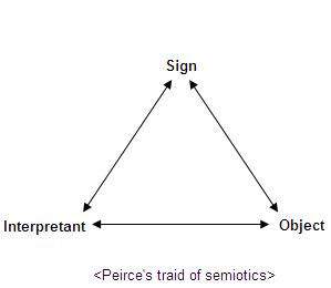
Saussure - > " In everything their is a sign and a signified"
For example if rain is the sign then sadness or a miserable atmosphere is the symbol. Signs are Polysemic ; they are open to many interpretations.
Denotation = What is there.
Connotation = What it might suggest.
All media texts are encoded by producers and decoded by audiences.
In terms of a music magazine, an electric guitar logo on the front page could symbolize loud or rock music and attract listeners of that genre to read the magazine, where as a logo of a violin would suggest a classical genre of music and attract listeners of that genre.
Thursday, 20 January 2011
THE START OF MY AS LEVEL MEDIA COURSWORK.....
For my As Media coursowrk i have been asigned the preliminary task of creating the front page of a new school magazine featuring a photograph of a student in a medium close up, appropriatley laid out text and a masthead.
My main assignment taks is to create the front page, contents and double page spread of a new music magazine.
This blog will contain all my research, samples, drafts and all other pieces of data i use to help me create the best possible final product.
I will be updating this blog on a regular bases, feel free to read, follow, comment and complete any questionaires or poles posted.
Subscribe to:
Comments (Atom)